
Overview
MacromatiX has a range of reporting tools that are easily accessible on a mobile device. The modern report layout and formats are designed to be displayed on a mobile device and are easy to read and understand.
Mobile Reporting
- From the Menu tab, navigate to the Reporting tab
- Select Store Dashboard - Mobile
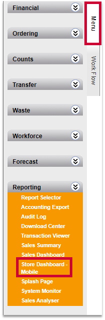
Fig.1 - Menu navigation
- Alternatively, log into the mobile site and from the Mobile Menu, select Operations
- Select Store Dashboard
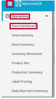
Fig.2 - Mobile navigation
Ops Dashboard
The mobile dashboard offers real time access to sales data via the mobile interface. It displays a quick snapshot for store managers to review their daily KPI’s to see how their restaurant is performing.
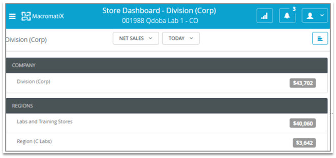
Fig.3 - Dashboard
- Select between the following options:
- 3 Types of Sales Data - Net Sales, Transaction Count, Ticket Average
- Time Range - Today, Yesterday, Last Year, Week, Month
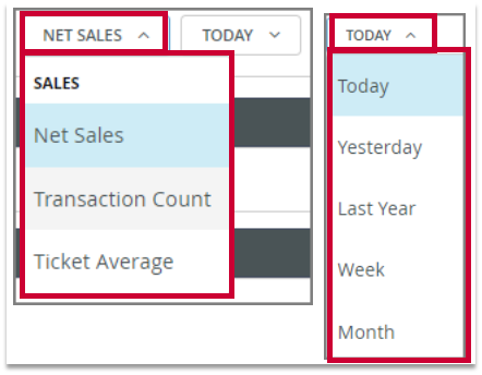
Fig.4 - Filter options
- Drill down to store-level data by selecting Company, Regions, Areas, Stores
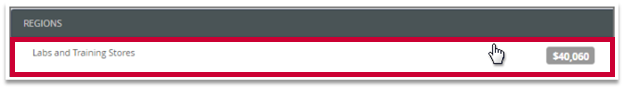
Fig.5 - Store selection
- The default display is Vertical Bars. Additional options include Line Graph, Horizontal Bars, and Pie Chart
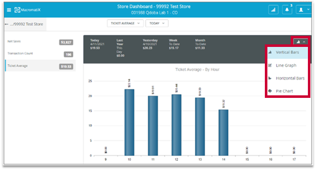
Fig.6 - Reporting options
![]() Reporting total numbers are compared against expected values and can be highlighted in the following format:
Reporting total numbers are compared against expected values and can be highlighted in the following format:
-
Red is displayed if the value is outside of the expected tolerance range
-
Green is displayed if the value is within the expected range
-
Grey is displayed if tolerance is not applicable to the reporting measure
Tolerance can be set at +/-10%
![]() Data may not display using the color-coding system if the tolerance range has not been properly set for the store. Please reach out to your corporate contact to request the tolerance to be configured for your store if needed.
Data may not display using the color-coding system if the tolerance range has not been properly set for the store. Please reach out to your corporate contact to request the tolerance to be configured for your store if needed.
Comments
Please sign in to leave a comment.