Overview
The Labour-Based Scheduling product provides easy access to add forecasts, schedule employees, and see how a business is performing. This article will show how to navigate through Scheduling from the Home Dashboard, and provide information on the Demand Forecasting algorithm.
For a list of all available Labour Based Scheduling articles, please visit: WFM: Labour-Based Scheduling: Getting Started
- Go to Scheduling > Home page
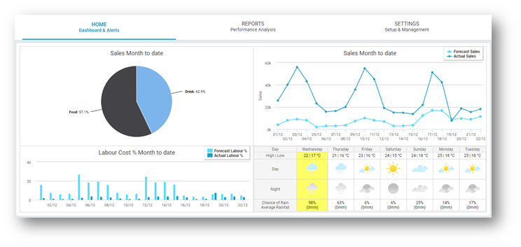
The homepage gives a selection of charts and graphs to provide an overview of the business.
Pie Chart: The pie chart shows sales figures, split by revenue stream if desired. Hovering over the pieces of the chart will show the amount of sales month to date for each revenue stream
Line Graph: The line graph to the right shows a comparison of forecasted sales vs. actual sales month-to-date. This gives a quick snapshot of how accurately the business is forecasting on a day to day basis
Bar Graph: Labour cost % month-to-date is also shown in the bar graph. Once a schedule is set to Approve, the system uses snapshot functionally to compare and see consistency between Forecasted vs. Actual Labour costs
Weather Forecast: This information is specific to the selected site's postcode is displayed

Fig.1 - The Home Tab
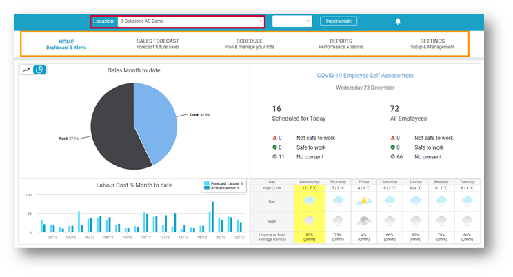
- Select a Location from the Location drop-down and more navigation options will become available

Fig.2 - The Homepage after Location Selection
Sales Forecast - Forecast future sales: Forecasted sales can be edited and viewed here, through a weekly, daily, and monthly viewpoint. Total sales, actual sales, budget sales, and last year’s sales can also be viewed.
Schedule - Plan & manage your rota: Update, edit and view employees’ hours and view financial information on wage costs, available for wages, wage budgets and actual sales.
Reports - Performance Analysis: Useful reports to supplement the Advanced Scheduling Solution can be accessed from here.
Settings - Setup & Management: Depending on access permission. Changes can be made to the configuration of the Advanced Schedule product here.
A similar version of this article is available, with extra information relating to Demand Forecasting.
WFM - Labour-Based Scheduling: Homepage with Demand Forecasting
Homepage Changes After Selecting a Location
If the Fourth Health Survey app is enabled, the available information on the homepage changes slightly once a location has been selected from the drop-down. For more information on the Health Survey app, please see WFM UK - Health Survey app - User Guide - UK.
-
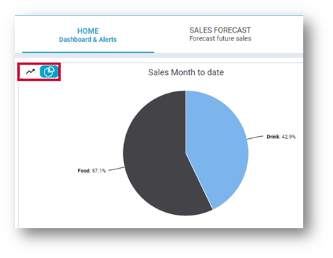
- The line graph, previously shown on the right of the page, is now hidden within the sales pie chart section. You can toggle between the pie chart view and the line graph view by using the icon shown in Fig.3

Fig.3 - Sales Pie Chart & Line Graph Toggle
-
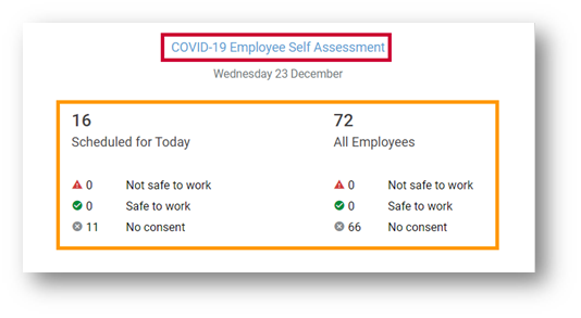
- The Covid-19 Employee Self Assessment section becomes available on the right of the page instead of the sales line graph as shown in Fig.4. Within this section, a quick report for each status for employees scheduled for today, as well as all employees is displayed. Select the section Covid-19 Employee Self Assessment to see a more detailed report.

Fig.4 - Covid-19 Employee Self Assessment

Comments
Please sign in to leave a comment.