
What’s Changing?
Select the release feature from the table below to be taken directly to that section of the release note.
| Feature 1 | Feature 2 | Feature 3 |
|
Customer brand colours applied more appropriately and consistently |
New icons and colouring for left side menu
|
Customer logo moved to the top of the left side menu
|
Release date: 12th October 2021.
Reason for the Change (all features)
To allow customers to reinforce their branding within Engage whilst ensuring that users with accessibility issues such as colour blindness are able to utilise the application. Displaying the customer logo more prominently and applying brand colours more consistently will provide a unified, accessible, and consistent user experience.
Customers Affected
All Engage customers.
Release Notes
Customer Brand Colours Applied more Appropriately and Consistently
Within the Salesforce administration console it is possible to specify colours to be applied to various parts of Engage. To simplify this, and to reflect that customers only tend to use 2 colours in their branding, the way that the colours are applied with Engage has been changed. Rather than have specific colours for specific parts of the application, company branding will now be applied using the principle of a primary and secondary colour scheme.
- Primary Colour would ordinarily be the darker, more dominant of the two colours.
- Secondary Colour would normally be a lighter colour than the primary colour
The branding scheme will also use a tertiary colour in some places, which will be the same as the secondary colour with an opacity of 10% applied.
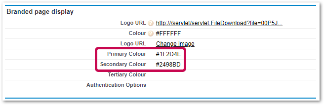
Fig.1 – Specifying primary and secondary colours
The way in which the colours are applied within Engage is described and illustrated below.
The primary colour (the colour specified in the field Primary Colour) will be applied to the following elements within Engage:
- The main page header
- The title bar of pop-up forms (such as the form used to enter details of a new post)
- Tabs (such as To Do and Actioned within the dashboard)
- Buttons
- Informational modals (such as the prompt asking a user to confirm when logging out of the application)
- Informational banner, or “Toast” messages (such as the message shown to a user informing them of video processing when creating a post)
- Toggle switches (such as the switch to enable to disable notifications)
- Drop-down lists and input fields when in focus (when selected)
- Progress bars (such as when a media file is uploaded to a post)
In the example below the primary colour has been set to dark green (#1B6140)

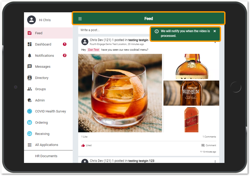 Fig.2 – Primary colour (green) used to colour the main page header and an informational banner/toast message
The secondary colour (the colour specified in the field Secondary Colour) will be applied to the following elements within Engage:
- The Like icon in the feed
- People’s names in @mentions in the feed
- The left-side menu icon for the selected menu item
- Counters (such as the number of unread notifications)
In the example below the secondary colour has been set to red (#bd0b35)

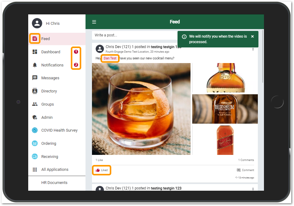
Fig.3 – Secondary colour (red) used to colour the selected main menu item, the like icon, a mentioned user and the dashboard and notification counts
The tertiary colour (the secondary colour at 10% opacity) will be applied to the following elements within Engage:
- The background to the selected left side menu item
- The background for a mentioned user
- The background for unread notifications
In the example shown above (Fig.3) the tertiary colour is light pink.
To provide an appropriate and accessible user experience there are some elements that will not have branded colours applied:
- The text font
- Alert bars, banner/toast messages and modal messages that signify success, warnings, or errors – these will use the standard green, amber and red colouring
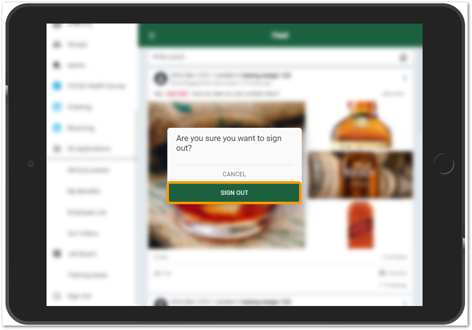 Fig.4 – An informational modal message using the primary brand colour
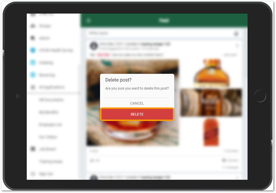 Fig.5 – A warning modal for a destructive action using the standard red warning colour
New Icons and Colour Scheme for the Left Side Menu
To ensure an accessible and clean design, the left side menu will now always be presented against a white background. As mentioned above, the colour of the selected menu items and any badges will be coloured with the customer’s secondary colour.
The icons used for the main menu items, such as Feed, Dashboard, etc have been updated to provide a more modern look and feel consistent with Fourth’s other applications.
The icons used for any connected apps are now presented as circular icons however the actual icons have not changed and will remain at the discretion of the provider of the connected app.
The icons used for custom menu items (as defined by customers) have not changed other than colouring.
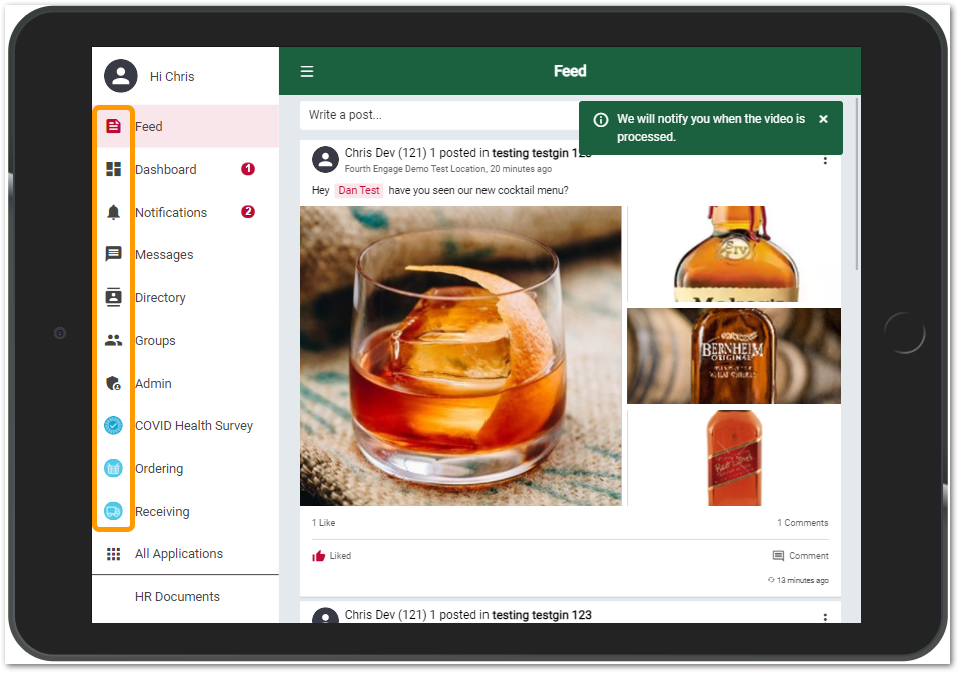 Fig.6 – Updated left side menu icons
Customer Logo Moved to top of the Left Side Menu
Previously, customers logos were shown at the top of some, but not all pages. As well as being inconsistent this also prevented the display of the page name. To provide a better user experience the page header will now always show the name of the current page and the customer logo will be displayed at the top of the left side menu.
- For a company logo to display well at the top of the left side menu it should have dimensions of 172x82px and ideally be a .svg image
- If a logo does not fill the entire rectangle then it should be set against a transparent background
- Customer logos are stored in Salesforce and Fourth's Solution Consulting team can assist with updating them if required
Further Reading
For additional information on this topic, please see Engage Mobile: Branding Guidance.
Comments
Please sign in to leave a comment.