Overview
This article describes the process of carrying out a Menu Engineering exercise, which can help to understand the relative sales and profitability performance of menu items.
The Menu Engineering tab is found within the Inventory and Requisitions dashboard. It is populated with data only if the core P&I solution has an itemised sales feed from the EPOS system, and recipes are linked to PLUs to register individual menu item sales. Otherwise, the tab will display no data.
 Fig.1 - Menu Item Classification banner
The onscreen reports compare the sales volume (popularity) and profitability of menu items relative to other products in the same recipe category. Based on this, menu items are classified according to the Boston Consulting Group matrix, which is explained in the banner box at the top of the tab - see Fig.1.
The left side of the banner shows the average quantity sold of each menu item in that category/outlet selected, and the average profit per item.
Menu Item Classification Report
This report lists items in order of recipe ID, and shows sales, popularity (quantity sold) and profitability as per the recipe cost linked to the relevant PLU (for the chosen time period). Item sales and profitability are then compared to the average for the recipe category in the banner (see Fig.1) to produce a ‘class’ as per the matrix described in the banner. If the recipe has not been given a recipe category, it will report as ‘empty value.
 Fig.2 - Menu Item Classification Report
Menu Engineering Report
This report lists items in order of sales ID, and shows theoretical profit (based on listed recipe cost and selling price) and actual profit (based on actual sales revenue from the EPOS system). This relies on recipe selling prices being accurate and up to date.
 Fig.3 - Menu Engineering Report
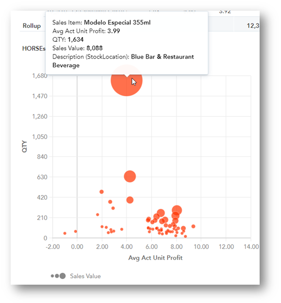
HORSE / STAR / DOG / PUZZLE Bubble Graphs
These diagrams show the menu item classification table in visual form for each of the four classifications. Each bubble represents a menu item, with bubble size determined by menu item total sales value. The vertical axis shows number of items sold, and the horizontal axis shows actual profit per item. Hovering over each bubble displays the data for that sales item.

Fig.4 - Example Bubble Graph with sales item data displayed
How To:
Decide which are the best performing beers on the menu.
- First choose the required time period using the Date Dimension (Business day) filter and Outlet(s) under Property Details
- Within the Product details filters, set the Category filter as required
- Review the Menu Item Classification Report
'Stars' sell well and are profitable so are the best performing menu items.
'Puzzles' have potential to perform – they are profitable but do not sell well. Is there way to increase sales of these without compromising profitability?
'Horses' are dependable – they sell well but are not particularly profitable. Is there a way to increase profit without overly impacting sales?
'Dogs' are below average in terms of both profitability and sales – they are the worst performers and potentially need reviewing or removing.
Check the Menu Engineering Report particularly for 'Dog' and 'Horse' classified items to review recipe selling prices for differences between actual and theoretical. It may be the theoretical selling price is not up-to-date or is not being achieved, which may explain unexpected poor performance.

Comments
Please sign in to leave a comment.